
Web design trends change every year and so many awesome things are being published daily. Judging by what we experienced in web design so far, we can only predict that the best is yet to come in 2018. As technology advances and becomes more ingrained into every facet of our daily lives, users are demanding more and more from their online user experiences (UX).
Personal, interactive, and relevant are three keywords users want from their UX. It basically means web designers now face the challenge of developing a website which understands and responds to its users throughout the process. If done boldly, this can push the limits of human interaction and imagination.
In 2016, the use of mobile devices to surf the Internet has finally exceeded the use of desktop computers. The mobile race for digital space continued to run in 2017. Next, in 2018, web design will come to innovations that will aim to take full advantage of the mobile functionality we could never have on desktop computers. A word that will mark web design in 2018, they say, will be “performance”.
We’ll boil down some of the latest web design trends for 2018 in this post. Some of these predictions will be more about what we would like to see, rather than what we’ll definitely see. Based on discussions with LKnet design team, let us take you through the latest web design trends and how to continue reaping their benefits going forward into 2018.
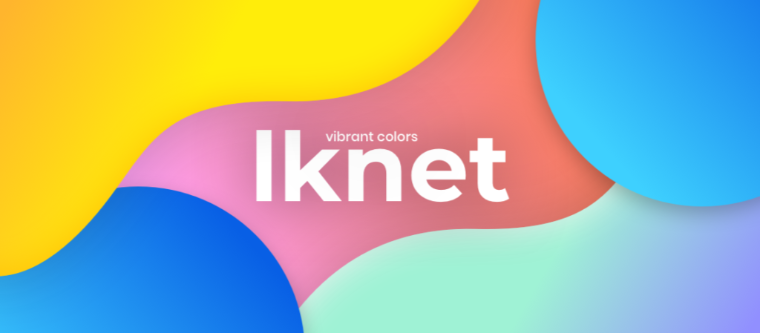
1. Vibrant Colors – There And Back Again
Bright colors spark our energy, keep us engaged, and fire up our buying power. They are positive, eye-catching, and they keep our attention. Color is one of the most powerful tools in a designer’s toolkit. It can draw attention, set a mood, influence users’ emotions, perceptions and actions. Over 90% of our assessment of a product is made on color alone.
Designers use vibrant colors to make people focus their attention on important elements and make their design memorable. They have the power to convey and communicate meanings and messages without words. On an emotional level, it can affect how consumers feel when they look at a brand.
More people today are taking bold risks with color, partly because there are so many choices available in the color spectrum. RGB colors, the range of colors used in website design, offers a lot of different variations, so website designers have been experimenting with blending them, deepening them, or placing highly saturated vibrant colors against a dark background.
Color will be used not only for aesthetics, but it’ll also be a part of the functional experience. For example, designers will use color to visually separate different types of notifications.
2. Mobile Design Is Taking The Throne
In 2015, 52.7 percent of the global mobile phone population accessed the internet from their mobile phone. This figure is expected to grow to 61.2 percent in 2018. This is pretty cut-and-dry. If you want your site to perform well, it needs to be optimized for mobile.
Over 50% of smartphone users grab their smartphone immediately after waking up, according to Express Pigeon. I’ll admit it, this includes me. Keep this in mind when scheduling your content or sending emails.
With the release of Samsung Galaxy S8 and iPhone X, frameless design became a trend. More screen space is available for users and they expect to have full-screen experiences. It is not only essential that your app provides full-screen experience – the quality of assets will have a direct impact on user expectations about your app. Moreover, images should not appear pixelated on a mobile screen.
Linear design experience is UX with a specific beginning, middle, and end that allows users to complete one action with each step. Linear user flow is good for users because it allows estimating the amount of time required to complete a task. Well-curated and easily accessible content is what makes a mobile app appealing to its intended users.
Strong visual signifiers (such as contrasting colors for call-to-action buttons) will continue to be used to direct users to certain interactive elements or essential information.
3. Video Storytelling Domination
Video is becoming the dominant type of content for the 21st century. The last few years have been about skyrocketing video numbers. We are up to a collective one billion hours a day of YouTube viewing. 2017 saw a surge in the popularity of video as a content marketing format. According to Hubspot, 78% of people watch videos online every week, and 55% watch videos online every day.
Storytelling should be at the core of any video strategy. Connection at all levels is based on the fact that users increasingly want a special experience, a value that will confirm their enthusiasm and passion, and among other things they will give them more.
Including video on a landing page can increase conversions by 80%and if your email subject line contains the word “video” your open-rate will go up by 19%. On average, people spend 2.6x more time on pages with video than without it.
75% of executives watch at least one work-related video every week, according to research by Hubspot. So there’s a huge potential audience out there for your videos. Business owners and decision-makers want information fast, with advice that helps them understand and resolve their financial, business and strategic issues.
4. SVG
SVG is an abbreviation for Scalable Vector Graphics, and it’s clear from the first word why it is so popular. It is the perfect ingredient for responsive design. SVG is a vector image format for 2D graphics based on XML. The SVG specification is an open-source standard developed by W3C in 1999 and as you can see it has been here for a long time.
The biggest benefit of SVG is resolution independence. Because SVG files are vector graphics instead of pixel-based raster images, they can be resized without losing any image quality. This is especially helpful when you are creating responsive websites that need to look good and work well across a wide range of screen sizes and devices.
SVG files can be scaled up or down to accommodate the changing size and layout needs of your responsive website and you do not need to worry about those graphics having compromised quality any step of the way. SVG, while not yet one of the most widely used image formats out there, is well documented, strongly supported, and it’s a big part of the Internet’s future.
If you’re not using it as part of your design process yet, it’s probably time to start.
5. Micro-interactions
Micro-interactions are subtle moments centered around accomplishing a single task. Almost all applications around us are filled with micro-interactions. Small details are what creates flawlessuser experience. These are the details that make your website users love your online presence, or hate it.
The most well-known example of a micro-interaction has existed long before computers were ever invented. The on/off switch is the first micro-interaction people encounter with a product. Animated icons and features can serve as helpful beacons along pathways in UIs.
Even though a user’s journey in software unfolds entirely behind a layer of glass, life-like buttons can minimize confusion by registering UI manipulation immediately. Designers should consider how a micro-animation will impact the user not just once, but repeatedly.
Micro-animations should always showcase software functionality and not the animation itself. Anything else can prove distracting. Worse, heavy-handed animations can slow down the software and the user’s journey within it.
Micro-interactions, at their best, provide a utility as good as their enjoyment factor. But, when you view all successful micro-interactions together, the one thing they all have in common is that they add a little personality to the site or app. This of course changes depending on the personality of the site itself — micro-interactions can be cartoony, or strictly business-oriented in streamlining a task.
2018 is going to be an exciting year in web design. The underlying question around all these design trends is: How can I get (and keep) my users’ attention and focus? The answer is: with vibrant colors, (SVG) animations, videos, and amazing mobile interactions!
Let your NEW design determine the standards.
Be one of the first to implement these 5 latest web design trends for 2018, email us at
info@lk-net.com!
Tags in this article
outsource web design outsourcing company outsourcing trends trends in web design trends in web design 2018 web design trend web design trending web design trends web design trends in 2018References in this article
Jacob K. Javits Convention Center 2010 Full list TechDay Los Angeles TechDay London
Be sure to check out
Other stories that you might like
Looking for a partner?
We would love to help
Don't waste your time.
•Copyright © 2024 LKnet•All rights reserved.