
In their evolution, all kinds of technologies around us are always striving to become more practical. Even without having this in mind, it’s not hard to notice that handheld devices are being used for web browsing more than traditional computers. Mobile web browsing has been steadily growing since 2009, while the desktop’s share of web traffic has steadily decreased.
Why so? It’s simple! People are more often near smartphones and tablets when in need of internet browsing. Handheld devices are easily approachable and always in near reach.
What does this mean for business owners? This information should definitely serve as a wake-up call for them to make their websites mobile friendly. To understand how truly important this is, have in mind that loading a desktop version of a website on a mobile phone can vastly decrease user experience, which leads to bad impressions of your business.

Doesn’t matter if your business is small or big, having a mobile-friendly website can greatly contribute to your business’ overall success and general revenue.
With years of professional experience in website development, LKnet developers and designers share the top 9 most important rules to follow when building a mobile-friendly and responsive website:
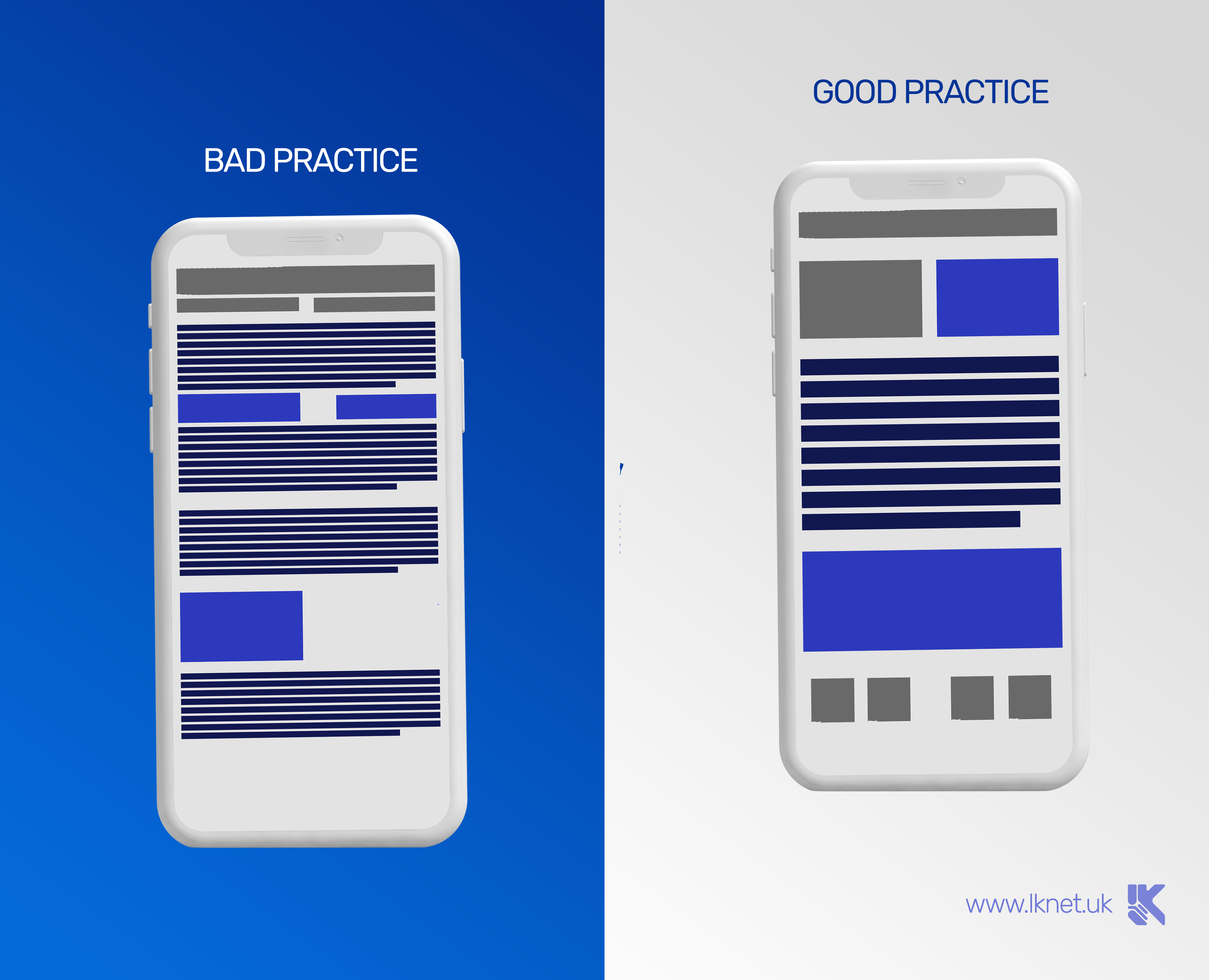
1. Just enough content
Quick and easy to find information is the best kind of information! Right? Well, this is really important when it comes to the amount of content on handheld devices. Knowing that less is more when it comes to mobile UI and UX design can increase the satisfaction among possible clients visiting your website.
Well, isn’t this true even for standard desktop websites? Yes, but smaller screens offer a smaller area for content. Scaling down the size of a desktop website proportionally to the size of an average phone makes the text so small it becomes unreadable. Leaving the desktop version of a website to load on phones makes people have to zoom in and wander around your website in search of what they need. This makes users uncomfortable, lost, and they will most probably just leave your site and go find one that is easier to go through. If your concurrent company has a mobile-friendly website, you’ve probably just lost a possible customer/client.
2. Simple navigation
Making sure that navigation is easy to understand and simple to go through is a factor of great importance which plays are a role in saving time. People using mobile phones are usually in a hurry and need the information as soon as possible. Having them tangle inside your website’s pages to dig out information they need will definitely leave a negative impression.
3. Size of screen elements
On desktop websites people interact with elements using a cursor with high click precision while interacting with handheld devices, people use their fingers. Fingers cover a larger amount of pixels when touching the screen which makes it harder to click on the desired button if the screen elements are too small. Having them big enough will make sure to reduce this problem which can easily cause frustration.
It’s not only about having the click targets big enough, but it is also important to have the space between them large enough to be easily interactable and aesthetically pleasing at the same time.
Most of the mobile developers have guidelines and recommendations when it comes to target sizes and other UI elements, and it is important to know how to adapt your website to all of them.
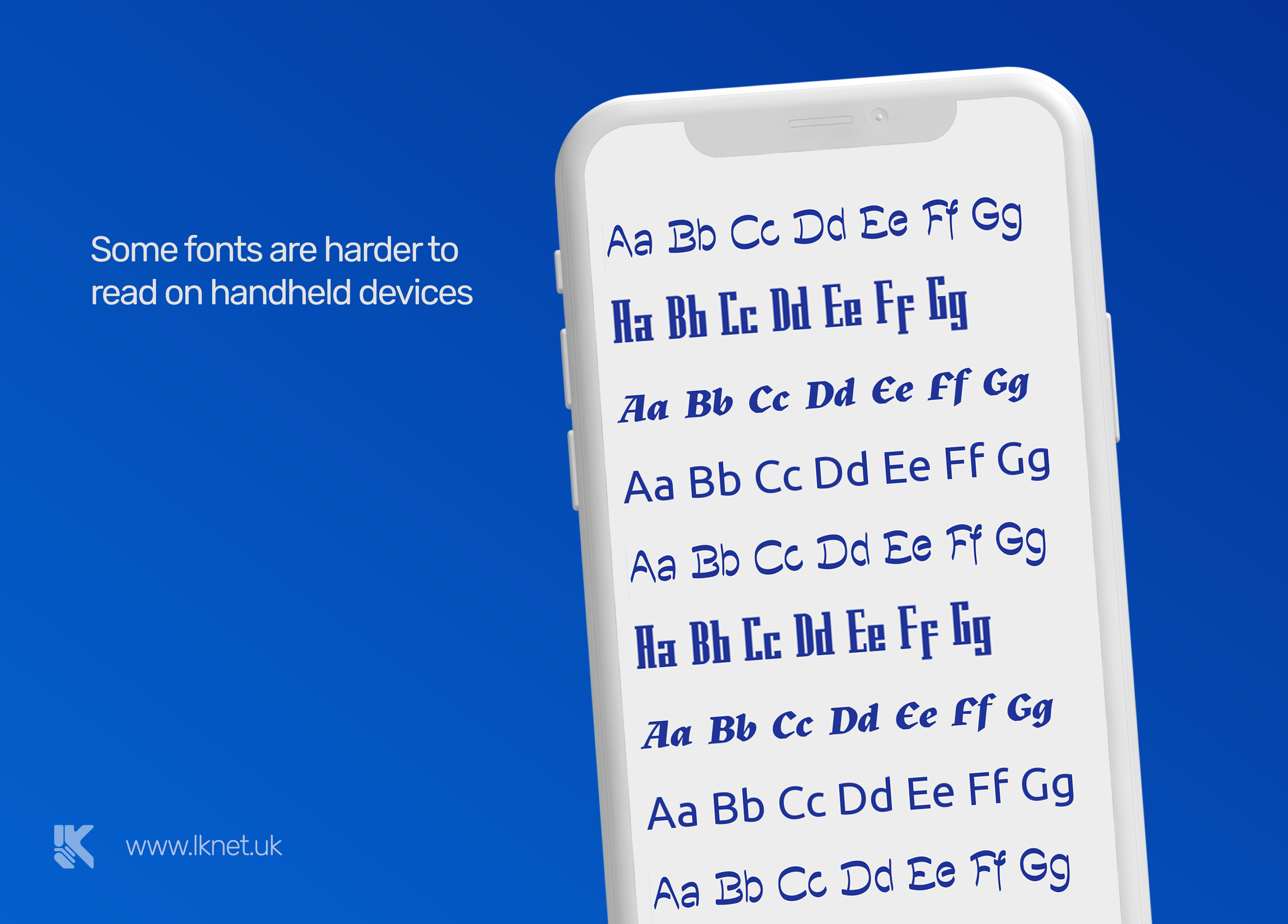
4. Texts and fonts
Number one rule in typography when it comes to websites is readability. If you use handwritten or fonts that are heavy on detail, it makes it harder to read. Especially when it comes to small screen sizes.
If people can’t read text on your website, the whole purpose of it goes down the drain. But, it is also important to know which simple fonts to use and how to format them so your website doesn’t look too simple or boring. Functionality is super important, but having a more aesthetically pleasing website than your concurrent business will only give you extra points in the eyes of possible clients.
5. Elements visibility
Designers must know the priority of elements being displayed and the amount of their visibility. Is the image more important than text in one section of the website? Are they equally important? This depends on many situations on just one webpage.
It’s also important to know that people use phones both outdoors and indoors. The contrast and brightness of your textual and visual content should be well balanced, which is not always easy to achieve. Different phone displays will render your content in different ways. To make sure to get everything right, you have to do a lot of testing on different devices.
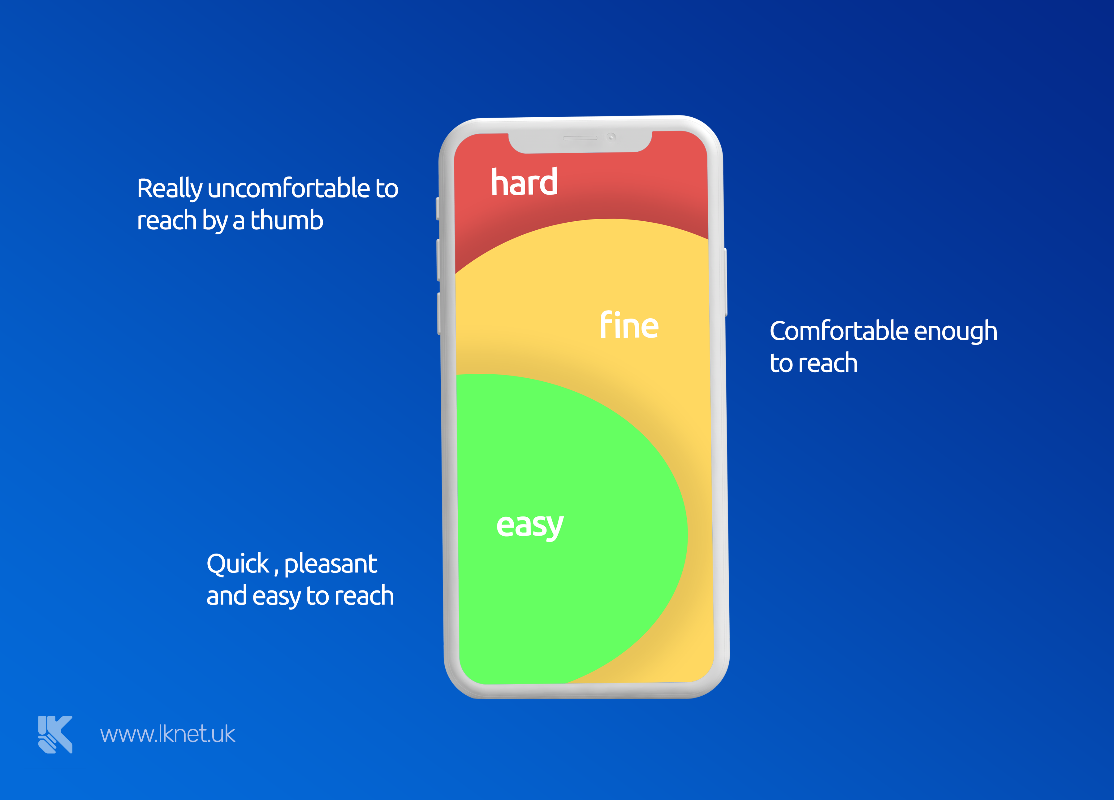
6. Fingers’ reach
On your mobile version of a website, you must be able to predict or know which click targets will your visitors click the most and in which situations. Commonly used features should be put in the area of the screen that is easily reachable by fingers, most commonly by the thumbs.
The click target should also be arranged in a way to not cause confusion and wrong clicks.
7. Input
Data input should be minimized. If there are some commonly used inputs, you should make sure to predict them and help users avoid typing them in if possible. Rather have them choose from the drop list, or have an algorithm recommend the input by the common input of other users.
This also depends on the type of data user is required to input, and giving them shortcuts and saving their time whenever it’s possible will greatly improve the flow and general user experience.
8. Lots of testing and experimenting
Different things work with different websites, business, themes and similar. Lots of testing and experimenting is required in order to reach the design’s full potential. There are a lot of types of handheld devices and loads of different mobile web browsers. Making sure everything works for everyone is key to getting a wider audience satisfied.
9. Aesthetics
As briefly mentioned before, having an aesthetically pleasing website is more important than people think. Following and implementing the above-mentioned rules is important, but knowing how to combine them in such a way to make your website both beautifully looking and functional is possible only with a lot of relevant and quality experience.
Here in LKnet One of our biggest passions is delivering user-friendly web and mobile applications that truly improve our customers’ internal processes or help them communicate with their prospects in a modern, meaningful way. In mobile development, we adopt the customer-first strategy to ensure a smooth experience and we are unstoppable until we get to that win-win solution.
Yes, we can help you with your website! What are you waiting for? Why don’t you contact us and schedule a meeting?
Tags in this article
mobile development app application phone website mobile friendly ui ux mobile rules design rules iphone android responsiveReferences in this article
Jacob K. Javits Convention Center 2010 Full list TechDay Los Angeles TechDay London
Be sure to check out
Other stories that you might like
Looking for a partner?
We would love to help
Don't waste your time.
•Copyright © 2021 LKnet•All rights reserved.